
Teach them how to fish — digitally.
Redesigning a D.C. nonprofit's digital fundraising experience to survive beyond its founder.
UX Design Lead
10 Weeks
User Donation Flow

The Challenge
"Give a man a fish,
feed him for a day."
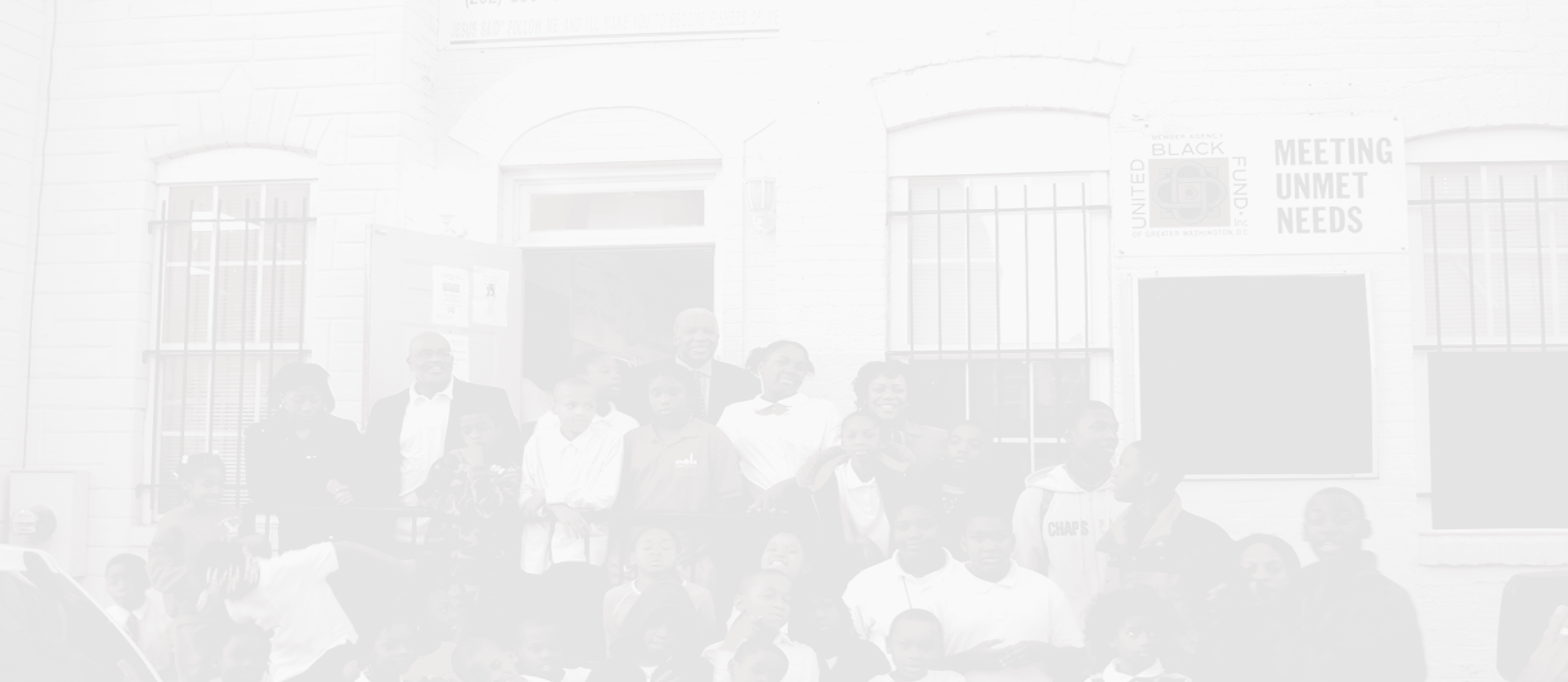
The Fishing School (TFS) is a Washington D.C.–based nonprofit providing after-school education for children from under-resourced communities. For over 30 years, its fundraising relied almost entirely on the founder's personal network.
When the founder passed away in 2022, that model collapsed overnight. Government subsidies were tightening. The organization needed to pivot fast to donor-direct digital fundraising.
But the existing website wasn't built for that job.
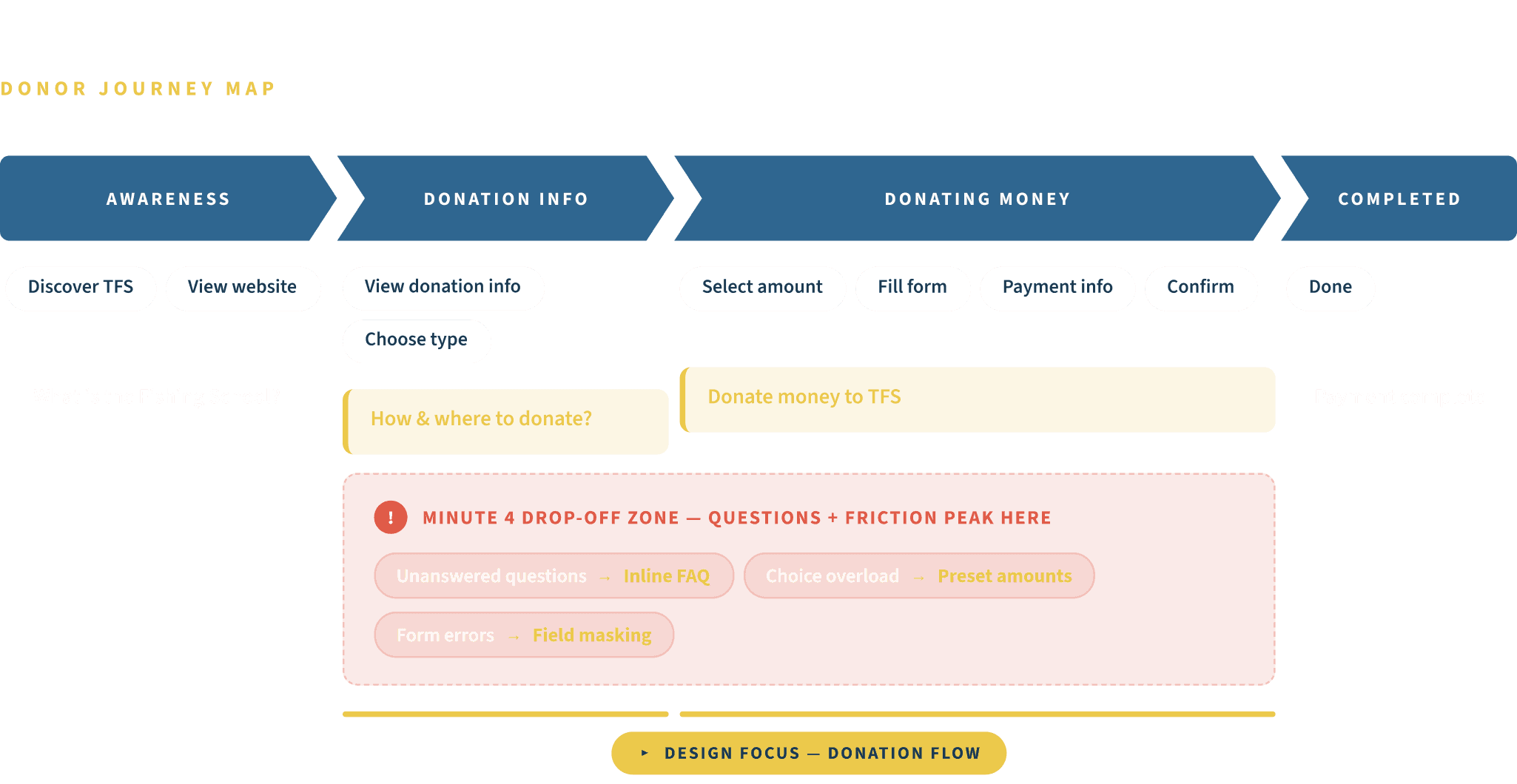
Usability testing revealed that 25% of users needed 6 minutes to complete an online donation. Most dropped off around minute 4 and never came back.
My Role
Not a redesign
brief. A survival
brief.
What I Shipped
Research & audits → research-driven IA → donation flow redesign → high-fidelity UI → microcopy system → interaction specs
Why Donation
Usability tests showed 25% of donors needed around 6 minutes to complete a donation, with most drop-offs around minute 4, so we focused on the highest-leverage conversion path.
Constraints
Existing CMS + third-party donation window + minimal dev bandwidth
Results
67.5% fewer steps, higher completion, and reusable communication templates/components.
Needs Alignment
Three voices, one goal.
🤝
The Donor
Local Caregiver and Hero-type community members who need a fast, trustworthy donation experience and transparent proof of impact. They don't just give money, they give time, mentorship, and resources. They need to feel they belong.
The Client (TFS)
Aims to use low-cost website optimizations to strengthen self-funding capacity, drive offline community engagement, and increase brand visibility, all without the founder's personal network.

The Partner
Contributing pro bono staffing to accelerate delivery. Prioritizing low-complexity, measurable, handoff-friendly solutions. No direct ROI target, this is about social impact done efficiently.
Discovery
The real problem
isn't the website.
It's the path.
We interviewed multiple stakeholders across TFS's service ecosystem — donors, staff, board members, and the Deloitte team — to understand how to help users make fast decisions while building consistent brand trust.
What the data told us: Despite posting at a similar cadence to comparable D.C. nonprofits, TFS's social engagement was significantly lower. The website had traffic, but it wasn't converting attention into action.
The donation usability test was the sharpest signal: users got lost navigating between pages, couldn't find answers to basic questions without leaving the flow, and abandoned the process when friction exceeded their motivation.
Who we're designing for:
Middle-aged, analytical, deeply community- involved. They care about education outcomes and want to understand exactly where their money goes before committing.
Community-rooted with a strong sense of identity. They contribute money, time, and resources. Donating is an act of belonging, not just generosity.
The core insight: TFS didn't need a new website. It needed a redesigned path — from "I noticed TFS" to "I just donated" — that respected both the donor's time and the organization's constraints.
Strategic Framework
Don't rebuild.
Re-route.
Highest leverage under a $5k cap.
Within 10 weeks, we couldn't redesign everything. So we asked: Where can we create the biggest lift with the smallest build?
The data pointed to one place: the donation path. In testing, 25% of donors took ~6 minutes to complete a donation, and most drop-offs clustered around minute 4 — when unanswered questions and page-hopping friction exceeded motivation.
Converting
Turn attention into action by keeping decisions fast, on-page, and low-friction.
Remove page-hops and redundant steps
Translate dollars into outcomes ("$X = Y hours")
Resolve hesitation in flow (inline FAQ, validation, presets)
Delivering
Turn a one-time donation into a long-term belonging through transparent impact + consistent communication.
Visualize outcomes (core metrics + proof chain)
Align story and cadence across social, offline → site
My prioritization decision
1
Signal
Clearest friction marker (~6 min completion; drop-off around minute 4)
2
Critical path
The most direct funding mechanism when resources were tightening
3
Feasible under
constraints
Improved IA + interaction design within the existing CMS + third-party donation window (no new platforms)
We aligned the other improvement areas via templates/components, and scheduled them for the next validation cycle, so we could ship confidence where it mattered most first.
Design Guide
A system, not a
one-time fix.
Our donor archetypes, community pillars who value trust and belonging, required a visual system that feels warm, credible, and consistent across every touchpoint.
Brand Colors:
Saffron
Indigo
Blue
Indigo for content and hierarchy. Saffron only for primary actions. This consistency reduces cognitive load for users and training effort for the operations team.
Iconography: Rounded, outlined icons reflect TFS's caring character. No filled icons, no sharp edges, scalable across web, social, and print.
Why this matters: Every component was designed so that TFS's small team can produce consistent content without a designer, from social posts to printed flyers. The system pays for itself by reducing ongoing production costs to near-zero.
Iconography
Icon Rules
STEAM System
Visual Exploration
✓
Outlined only
✓
Rounded corners
✕
No filled icons
✕
No sharp edges

Solution
Four levers. One conversion
engine.

Primary Focus
Donor Flow Redesign
The old donation experience forced donors to bounce across multiple pages, choosing donation type on one screen, amounts on another, contact info on a third, and answers on a separate FAQ page. Drop-off peaked around minute 4, when friction overtook motivation.
Consolidated the entire flow into a single view. Users toggle between Individual and Organizational donations at the top, select a preset amount, and complete contact information — all without leaving the page.
Added impact anchoring. Preset amounts include a concrete equivalency (e.g., "$25 = X hours of tutoring") so donors can decide with confidence, not guesswork.
Moved FAQs inline. Common questions expand right below the form, keeping uncertainty in context instead of sending donors away.
Built real-time input validation. Auto-formatting (ZIP/date/phone) and inline errors prevent small mistakes from
becoming abandonment, especially at the 3–4 minute mark.
1
Persistent Donate CTA
Saffron button in nav, any page becomes a one-step action.
3
STEAM Visual System
Color-coded shapes replace stock photos, ownable, scalable, printable.
2
Impact Data Up Front
"8,000+ students served," and outcome metrics replace generic copy.
4
Social Proof Cards
Real testimonials with names and roles replace anonymous copy blocks.
Result: Donation steps reduced from 10 to 4. Completion time from ~6 minutes to under 2 minutes, a 60% reduction in steps and 67% faster completion.
Content Simplification
Show me what I
need. Skip the rest.
The original Programs page was written from the organization's perspective, long paragraphs about curriculum philosophy and institutional history. A parent trying to decide if TFS was right for their child had to read hundreds of words before finding basic logistics.
Shifted the content strategy from organizational voice to a user-task perspective. The redesigned page opens with the program title and a one-sentence value proposition, followed by four quick-scan icons: school location, time slot, frequency, and whether meals are included.
The design logic: A Caregiver parent can now determine whether a program fits their family in under 10 seconds then decide to learn more or enroll.

Component Toolkit
Built to last without us.
Every component was designed with two audiences in mind: the end user, and the TFS operations team who would maintain the site long after our engagement ended.
Header
Persistent Donate button in Saffron. Task-oriented navigation: donate, volunteer, enroll, learn.
Text Inputs
Standardized labels, keyboard types, input masking, inline errors. Designed to prevent 3–4 min drop-off.
Donation Selectors
Preset amount cards with "$X = Y hours of tutoring" prompt. One-tap to reduce hesitation.
Color Discipline
Indigo for structure. Saffron for actions only. Two-color rule = economical to maintain and print.
Colors
Primary Palette
Indigo
#254E70
Structure, text
Saffron
#ECC94B
CTAs, active
Cream
#FAF8F5
Background
White
#FFFFFF
Cards, inputs
Indigo Opacity Scale
60%
Body text
40%
Captions
20%
Borders
8%
Dividers
Semantic Colors
Success
#2ECC71
Error
#E74C3C
Warning
#F39C12
Typography
Display
Playfair 48/52 Bold
Every Child Deserves a Chance
H1
Playfair 36/40 Bold
Educational Programs
H2
Source Sans 24/30 Bold
After-School Enrichment
H3
Source Sans 20/26 Semi
Community Events Calendar
Body
Source Sans 16/26 Regular
The Fishing School has served over 8,000 students, providing academic support and life skills training.
Caption
Source Sans 13/18 Semi
Mon – Fri · 3:00 PM – 6:00 PM · Leckie Campus
Overline
Source Sans 11/16 Bold Caps
Educational Programs
Button
Source Sans 13/16 Bold
Enroll Now →
Spacing
8px Base Grid
4px
--sp-xs
Inline icon gaps
8px
--sp-sm
Label-to-input
16px
--sp-md
Card padding, field gaps
24px
--sp-lg
Section margins
40px
--sp-xl
Block separators
64px
--sp-2xl
Page section spacing
Desktop: 4-col · 1200px max · 24px gutter | Tablet: 2-col · 16px gutter | Mobile: 1-col · 16px margin
Buttons
Primary CTA
Enroll Now
Default
Enroll Now
Hover
Enroll Now
Active
Enroll Now
Disabled
Secondary CTA
Learn More
Default
Learn More
Hover
Learn More
Active
Saffron CTA (Donate)
Donate
Default
Donate
Hover
Selective / Filter
All Programs
Unselected
All Programs
Selected
Donation Amount Grid
$25
1 hr tutoring
$50
2 hrs tutoring
$75
3 hrs tutoring
$100
STEAM kit
$150
1 week meals
$200
1 month support
Form Controls
Text Input States
Default
Parent Name
Enter
Enter
Focused
Parent Name
Maria Johnson|
Phone
(202) 555-|
Filled
Parent Name
Maria Johnson
City
Washington, DC
Error
maria@
⚠ Please enter a valid email
Phone
⚠ Required field
Select / Dropdown
CLOSED
Select
▾
SELECTED
Leckie Campus
▾
Header · Footer
Desktop Header — Default
TFS
The Fishing School
About Us ▾
Programs ▾
Get Involved ▾
Contact
Donate
Desktop Header — Mega Menu
TFS
The Fishing School
About Us ▾
Programs ▴
Get Involved ▾
Contact
Donate
Educational Programs
After-School Enrichment · Summer Literacy · STEAM Workshops · Parent Orientation · Saturday Academy · College Readiness
Mobile Header
TFS
The Fishing School
Donate
☰
Mobile Menu Expanded
TFS
The Fishing School
Donate
✕
About Us ▾
Programs ▾
Get Involved ▾
Contact ▾
Footer
✦ The Fishing School
About Us
Educational Programs
Get Involved
Contact
Connect
Sign up for our newsletter
Send
Copyright © The Fishing School 2022 – All rights reserved.
Results
60% fewer steps. 67% faster.
Zero new tech.
10→4
Donation steps
~2min
Completion time (from ~6 min)
$0
Additional tech spend
10wk
End-to-end delivery
The Fishing School has begun implementing our design on their official website. We delivered a complete handoff package: a component library, a brand usage checklist, and a performance tracking plan, so the team can measure impact as each update goes live.
Constraints & Evolution
What I'd fish for
next.
What we chose not to do, and why:
This project operated under real constraints: $5,000, 10 weeks, and a two-person design team. We focused usability testing exclusively on the donation flow because it was the highest-impact path for TFS's immediate survival. The registration, volunteer flows, and cross-device consistency were designed but not individually tested.
If I had another iteration:
1.
Test the full registration and volunteer flows, both in-person and remote, to close the gaps we consciously deferred.
2.
Run A/B tests on donation presets and copy to optimize impact-anchoring language, alongside regression checks for performance and mobile accessibility.
3.
Establish content governance and training so TFS's operations team can produce on-brand content using templates without needing a designer.